
Oct 26, 2020
. UX Tools .
3 min read
How to improve your typography game?
Typography is an integral concept of UX designing. It is still often overlooked among the lot. Here we present the top tips to ace the typography game.
Typography is an integral concept of UX designing. It is still often overlooked among the lot. Here we present the top tips to ace the typography game.
- Sift your collection
- Play typography game
- Use just one typeface
- Draw it out
- Change one parameter at a time
- Explore typeface classifications
- Don’t suffocate designs
- Do a scavenger hunt
- Don’t hesitate to repeat
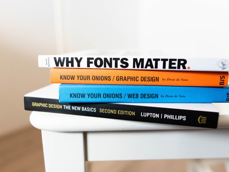
You don’t need tons and tons of typefaces. You can excel by using a set of just under ten typographies in all your work. That’s exactly what Massimo Vignelli did, and the pros eventually followed suit. He even calls the excessive creation of typefaces as “one of the biggest visual pollutions”. He considered excessive collections as vulgarity. By vulgarity, we mean a lack of sophistication or good taste. Ideally, you must use only the best typefaces.
The Font Fox game lets you test your knowledge on tons of different fonts. It is a free iOS game, and you can install it on any Apple device. Even better, you can play and challenge your Designlab buddies. Similarly, Type Connection game helps get a better understanding of how to pair fonts. You can learn about all the matching fonts in no time.
If possible, use just one typeface throughout the project. More often than not, it’s always possible. For instance, an academic project does well with the use of Vertica or Futura alone. It’s one of those secret tips that universities don’t teach you. However, if the project really demands it, you can use more than one typeface. Still, limit it to just two or three. Throwing too many typefaces into the mix messes up with your structure and flow.
Sometimes, getting offline is your ticket to learn more about design. Draw new fonts on paper as you learn them. On paper, you tend to make better observations than you would on a computer screen. When observing closely and replicating type style, you will appreciate the complexities of typography. Use typography knowledge to focus on how to draw and compare.
This is a pro tip from the book, ‘The Elements of Typographic Style” by Robert Bringhurst. It’s commonly dubbed as the bible of typography. For instance, when you are adding a subheading, you don’t have to come up with new font size, colour, and spacing. Change just one parameter and see if it’s enough. It helps prevent you from doing too many changes than required. When trying things out, be wary about the number of changes you make. “Less is plenty”, is the mantra.
For starters, classifications help identify tons of individual typefaces. It’s a great starting point to spot and pair typefaces. Understanding classifications makes the entire process as simple as 1-2-3. By definition, typeface classification defines different styles of style. Commonly known classifications are serif and sans-serif. To master the typography game, learn more typeface classifications.
Blank spaces may tempt budding designers to add graphical elements onto them. Blank spaces might seem like a nightmare until you master design perception. We rather suggest using white space to your advantage. It makes your main element to stand out. Moreover, white space cannot be equated with emptiness. It is a graphical element in itself. Do not stuff your design with elements, intending to cover up blank spaces.
Hunt for typefaces from music, movies, TV shows, brands, etc. FontsinUse brags itself as the ‘independent archive of typography’. It lets you know which typeface is being used where. You can filter the search based on typeface, format, and niche. You can scan through brand logos, album covers, magazines and more. There are plenty of font quiz apps to help you realize typefaces.
Nature is so predictable. The sun rises in the east and sets in the west every single day. It has happened throughout 7000 years of recorded history. As humans dwelling in it, we like predictability. We can prepare to interpret far better in a predictable environment. The same applies to graphical designs as well. After all, we are designing for human perception. If you are using a certain font size, use the same throughout your design. Don’t hesitate to repeat the same font size, weight, colour, etc. This way, people looking at the designs can understand it better.
Categories
UX Design Process
UX Tools
Consumer Experience
UI UXs