Oct 18, 2020
. UX Design Process .
3 min read
Bottom Navigation: A core element of UX design for mobile
UX Design influences how a user engages with the app determining the interactions model. Navigation is a form of communication.
UX Design influences how a user engages with the app determining the interactions model. Navigation is a form of communication. Regardless of how awesome your app is, the UX design process makes no sense if the users can't find their way around the app. In the case of smaller screens, navigation is a congested affair. The dynamics with taps are totally different than how they are with mouse clicks. Let's look at one of the key UX design tools for mobile apps – Bottom Navigation.
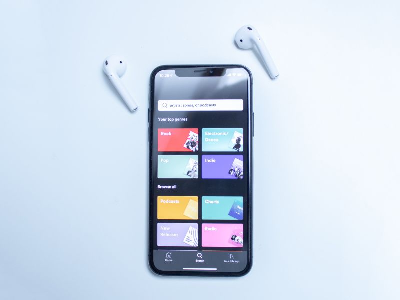
Significance of Bottom NavigationHalf of the people, who use smartphones, rely on one thumb to interact with phones. If you look at the heat map of smartphone screens, there is always an unreachable area, when you are operating with just one thumb. The top-level destinations, which are to be frequently visited, are better placed at the bottom of the screen. It is where people can comfortably make one-thumb interactions. Top-level destinations can include calling apps, home screen, and back to the previous function. Within apps, you may require a different set of top-level actions to be placed at the bottom.
Tab barFor the above-discussed factors, most apps use the bottom navigation bar. It is commonly dubbed as the tab bar, which contains the app's significant features. For instance, Facebook places elements of its core functionality available in one tap. It allows for rapid switching between features. Bottom navigation has become the norm in the Android era.
Important rules of bottom navigation design:- Avoid scrollable content:It's very annoying if you have to scroll through the bottom navigation bar. Pack all the important functions in available screen space. Scrollable content is not at all seen if the user never scrolled even once.
- Limit only to important destinations: At maximum, place 3-5 top-level destinations in the bottom navigation. If there are less than three destinations, resort to using tabs. If there are more than five destinations, the tab bar gets too congested.
- Make use of icons:Bottom navigation tabs are better presented as icons. There are some rare universal icons that work like a charm in any app. Avoid icons that are hard to recognize for their functionality.
- Show current location:Failing to communicate the current location is a designing blunder. It's very much against the ideal UX principles. 'Where am I' is the first question that needs to be answered to the user.
- Follow color codes:Following color codes is part of the UX design process. Bottom navigation is no exception to the rule. Colors help communicate the current path to the user as well as ensure consistency in interface design.
- Strive for consistency:UX design tools should always be presented with consistency. Display the same set of tabs in all orientations. Avoid removing a tab, even when it's unavailable. Ensure your app UI is stable and predictable.
Ultimately, you are designing it for the users. Factor in the user persona and what sort of solutions they expect from your app. From user flow, map all the navigation paths your users will likely take to accomplish goals. Helping users navigate within the app matters more than anything else. That's where UX design tools like bottom navigation bars come in handy.
Moreover, the goal is to create a vibrant interaction system that aligns with mental models of users. You should supply simplicity on top of user familiarity to turn your app into a true user's darling. The easier it's for them to use it, the more likely they will use it. The bottom line is the user's perspective holds a higher priority than that of any parties involved in the project.
Categories
UX Design Process
UX Tools
Consumer Experience
UI UXs